Landing pages have the potential to be one of the most effective tools for generating conversions. A landing page is a single web page that is designed for one specific goal, such as signing up for a service or making a purchase. While traditional web pages may have multiple purposes and elements, a landing page should have minimal distractions, a clear call-to-action, and a single purpose. A high-converting landing page allows marketers to measure the effectiveness of a campaign while targeting specific audiences with personalized messages, and small details of the page can significantly impact success.
In this blog, we’ll highlight what we believe are the top seven best practices for developing a high-converting landing page and give five examples of companies that have mastered these techniques.
Best Practices for High-Converting Landing Pages
Keep the Most Important Information Above the Fold
The portion of a web page that is visible to users without having to scroll is known as the area “above the fold.” For businesses wanting to generate conversions with their landing pages, it is crucial to place the most important content in this area to reduce bounce rates and prevent customers from losing interest. Some of the key elements to present above the fold include CTA buttons, product descriptions, and your value proposition. By showcasing the most important aspects of your landing page in this area, you draw immediate attention to them and reduce the chance of users becoming confused.
Personalize Your Landing Page
Keeping users engaged with your brand is one of the biggest objectives of any website, advertisement, or other piece of content, and personalizing the experience for users is a great way to engage customers. Users should immediately feel that the content speaks directly to them when arriving on your landing page. By segmenting your audience to tailor messaging or using a visitor’s name if that data is available, you can achieve high levels of personalization that draw users in.
Ensuring that each advertisement that you run has its own designated landing page is also essential. If you are running multiple ads with different copy and value propositions, each ad should direct users to its own personalized landing page rather than a generic one.
Clearly Describe Your Product
Visitors should understand exactly what you are offering and how it benefits them immediately after opening the landing page. When showcasing your product, customer desire comes from the value the product will bring to them rather than just understanding the features. It is critical to emphasize the benefits of your offering using easy-to-understand language and highlight them above the fold. Incorporating visuals or demos can bring your offering to life and make it easier for customers to see the benefits of purchasing your product or service. The more transparent and informative you are, the more comfortable visitors will feel about taking the next step.
Showcase Your Value Proposition
Your value proposition is the reason visitors should choose your product over others. It answers the question: Why should I care? A strong value proposition communicates the unique benefits of your offering, solving a visitor’s problem or fulfilling a need. It should be specific, easy to find on the landing page, and ideally be a part of the headline or featured in a prominent position near the top of the page.
Make Sure Your Ad and Landing Page Match
A user who clicks on an ad and is led to a landing page having little resemblance to the promotion they engaged with is likely to be confused or frustrated and immediately leave the page. Your ad and landing page must align when it comes to messaging, visuals, or offers. If your advertisement promises a discount, the landing page should reflect that same offer. Maintaining consistency between your ads and landing pages builds trust with visitors and encourages them to follow through on their initial interest.
Have a Clear and Compelling Headline
Your headline is the first thing visitors will see, making it crucial in capturing their attention and communicating the value of your offering. An effective headline should be clear, concise, and benefit-driven, immediately conveying what the visitor needs to know. Avoid vague or generic wording, and instead, use action-oriented language that addresses the visitor’s pain points or desires.
Make Your Call-to-Action (CTA) Strong and Visible
A call to action is arguably the most important part of your landing page. Your CTA should be one of the first elements a user’s attention is drawn to by being clear, compelling, and easy to find. Implementing bright colors that contrast the rest of your page is one of the best ways to make sure your CTA stands out and draws users in. The language should also be action-oriented so that users are prompted to take the desired action and should align with the purpose of the page. You can also include multiple CTAs throughout the landing page, especially if it is longer, to improve engagement by giving users multiple chances to interact. Finally, ensure your CTAs are fully responsive for mobile users. “As of November 2024, 64.04% of all internet traffic comes from mobile devices, while 35.96% comes from desktop” (Digital Silk), making it critical to optimize your site and CTAs for mobile traffic as well as desktop traffic.
5 High-Converting Landing Page Examples
1. Netflix
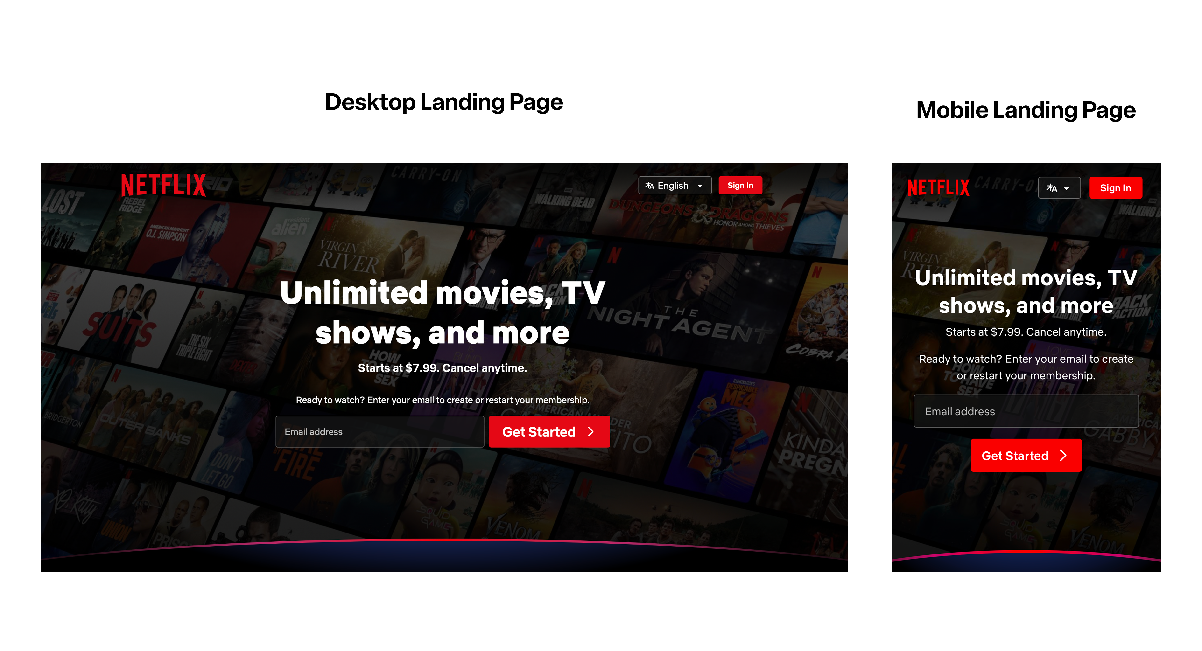
Why it works:
Simplicity: Netflix’s landing page is extremely simple, with limited elements to ensure users grasp the minimal but important information they are presented with. This allows users to focus on just a few details and highlights the action Netflix wants users to take.
CTA: The main call-to-action button is displayed prominently at the center of the page with a smaller CTA in the top right. The color contrast and placement make it a main focus point of the webpage, leading to higher conversions.
Product and Value: Without having an abundance of elements or information on the page, Netflix effectively showcases the product they are selling and the value of their product in a few simple words. The background visual also reinforces their promise for unlimited TV without overcrowding the landing page.
2. Nuuly
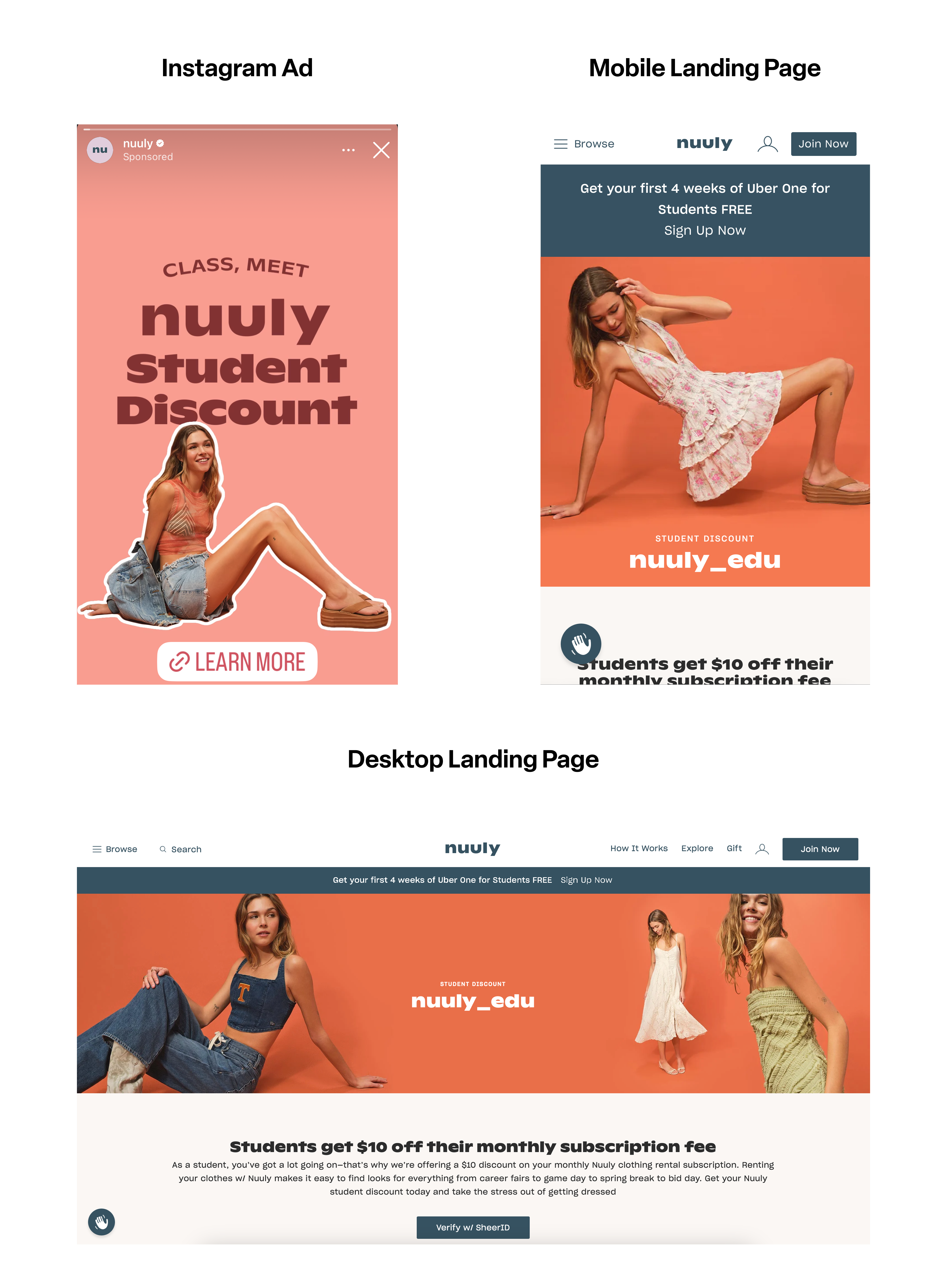
Why it Works:
Ad to Landing Page Relevance: The Instagram advertisement is promoting a student discount, which is featured directly on the landing page.
Personalization: Both the landing page and advertisement are personalized toward students. The clothing featured is younger, and the discount is tailored to students.
Mobile Optimization: The mobile landing page is extremely important in this situation because the advertisement is being run on Instagram. With 98% of Instagram users accessing the app through mobile devices, ensuring a seamless mobile experience is crucial (Measure Studio).
Action Above the Fold: For both the mobile and desktop experience, the featured image, promotion, and CTA are all visible without forcing users to scroll.
Strong CTA: The call-to-action buttons stand out on the landing page, and there are multiple CTAs throughout.
Compelling Headline: The headline is bold and immediately grasps the user’s attention through both the format and the copy.
3. Rivian
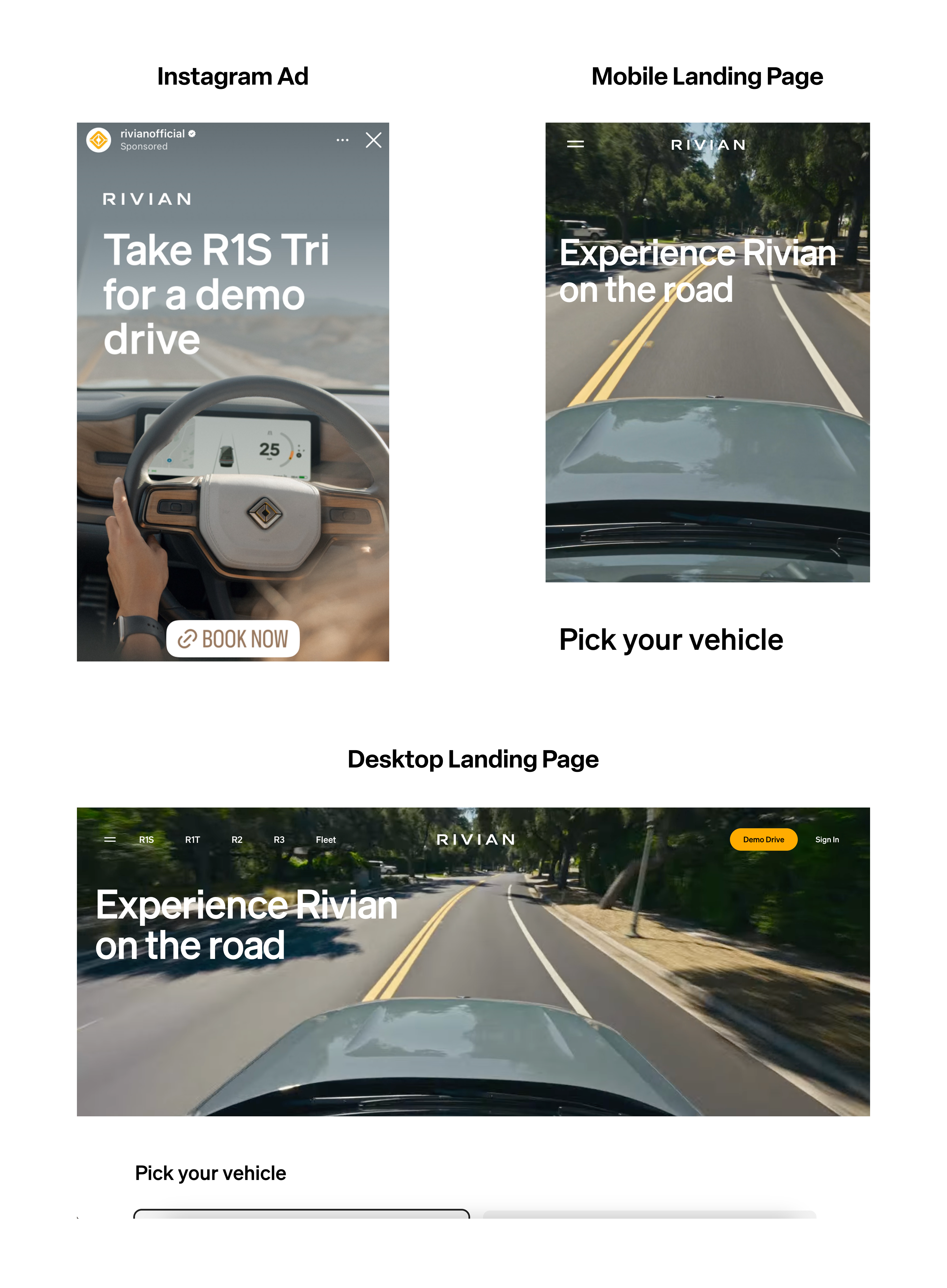
Why it Works:
Landing Page Relevance: When users click on the Instagram advertisement promoting a test drive in the Rivian R1S, they are directed to a landing page that allows them to immediately book their test drive.
Mobile Optimization: The mobile experience of this landing page is user-friendly, simple, engaging, and implements all of the elements of the desktop version. A common downfall of mobile experiences is overcrowding of information and elements, and this landing page avoids that completely with minimal elements shown at a time.
4. Discover
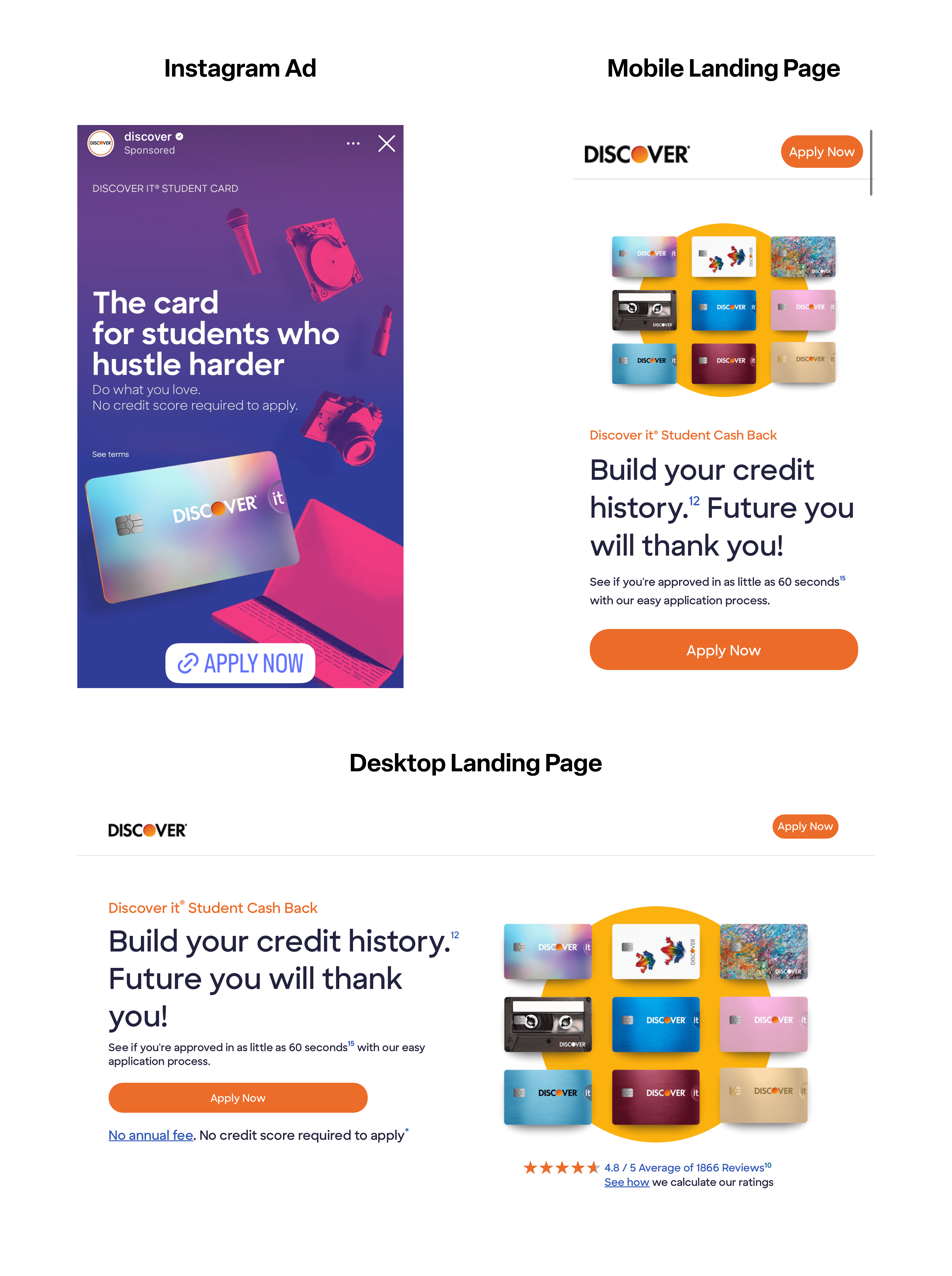
Why it Works:
Strong CTA: Both the mobile and desktop landing pages implement multiple CTAs that stand out and encourage users to apply for a Discover card. Because of the simple white background, the orange color of the CTA immediately captures the user’s attention, encouraging conversions.
Landing Page Relevance: The advertisement’s promotion matches the landing page offering students cash back with similar messaging.
Mobile Optimization: The mobile landing page is extremely simple and easy to understand, with all important information placed above the fold. The call to action, headline, and product image fit well on the page without seeming too crowded. More information for interested users is also provided further down on the page.
Key Elements are Above the Fold: On both the mobile and desktop landing pages, the call to action, headline, and product images are visible to users immediately after opening the page, allowing users to understand the product and desired action without having to scroll.
5. Grown Brilliance
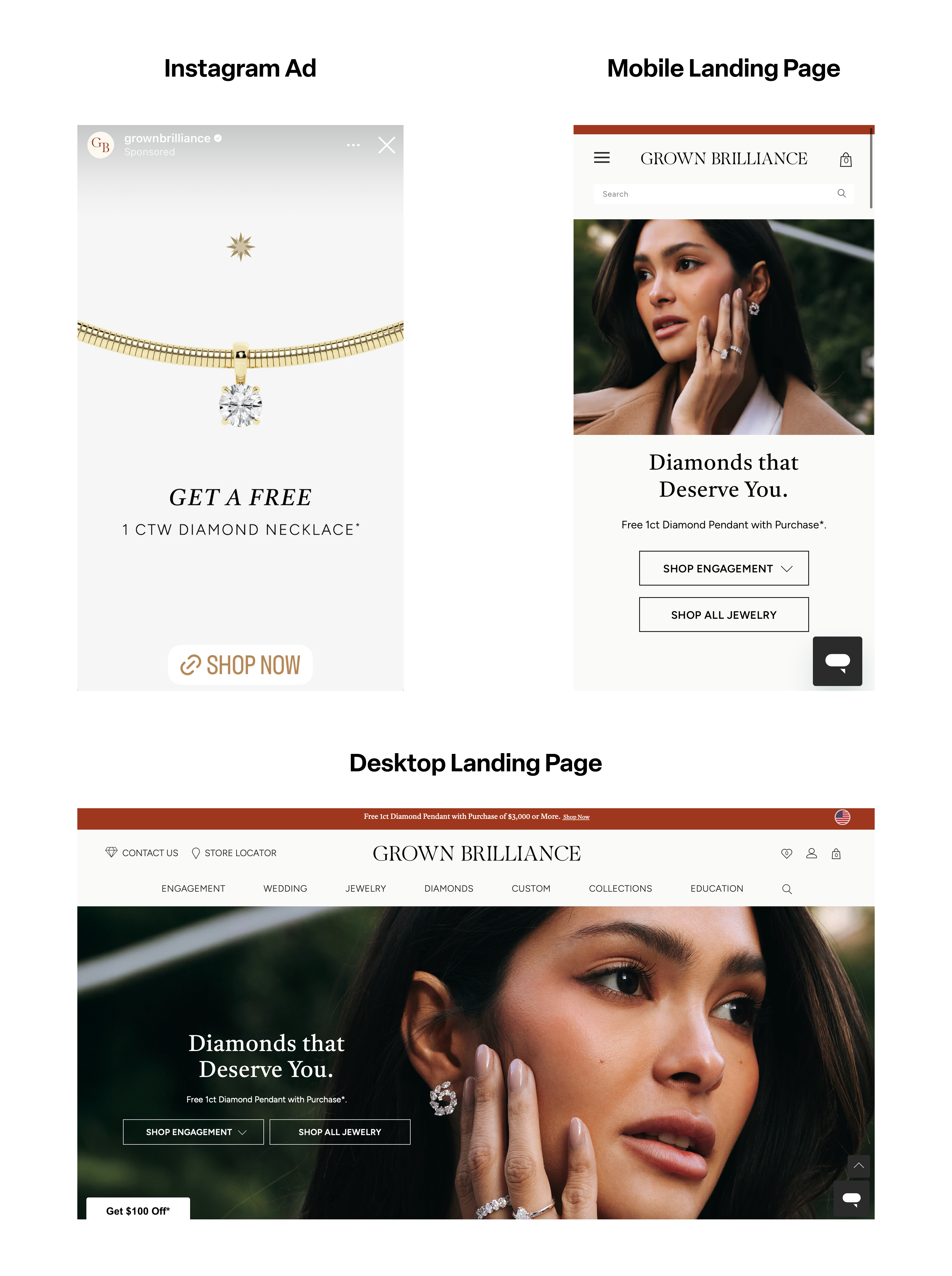
Why it Works:
Landing Page Relevance: The promotion offered in the Instagram advertisement of a free one-carrot diamond necklace is apparent on the landing page.
Simplicity: The minimal elements and information on this landing page allows users to have an increased focus on the offering. The headline is short, only one simple image is highlighted, and the CTAs draw attention without giving users too many options.
Effective Headline: The headline of the landing page showcases what exactly is being sold and engages the user in a few, simple words. Because of its simplicity, it is easy to understand and doesn’t take away from or overwhelm the rest of the landing page.
Key Elements Above the Fold: The CTAs, promotion, product, and headline are all placed above the fold on the mobile and desktop landing pages.
Conclusion
Effective landing pages that use the right strategies can have a tremendous impact on conversion rates. By implementing clear CTAs, making sure your headlines are compelling and showcase your product and value, personalizing your landing page, and ensuring the most important content is above the fold, you can increase the performance of your landing page greatly.
A/B testing your landing pages can also significantly improve conversion rates. With Compose, you can test unlimited elements to optimize your landing pages based on what your unique customers actually respond to. Download the Compose app today and start making data-backed decisions for only $0.0012 per monthly tracked user!